Vital Stats Graphs
The Vital Stats Graphs report provides two graphs for a visual image of contributions and attendance, comparing the current year to the previous year. It also includes a few Quick Stats for the current year:
Total Giving (total contributions for the year)
Total Attendance (the sum of all attendance counts for the year)
Average Giving per Attendance (Total Giving divided by Total Attendance)
Both graphs can be refined. For the Monthly Giving Analysis, you can restrict the graph to one or more specific funds. For the Monthly Attendance Analysis, you can restrict the graph to specific organizations.
The Vital Stats Graphs report is accessed at Reports > Statistics: Vital Stats Graphs, just below the Vital Stats report. While these two reports draw from some of the same data (attendance and contributions), the Vital Stats report looks at the past week, while the Graphs report compares the current year to the previous year.
By default, the Vital Stats Graphs is available to all users with the Access role. To restrict the graphs to only certain roles, enter the desired role(s) in the setting Vital Stats Graph Role. This setting is found at Administration > Settings on the System tab and in the Administration section.
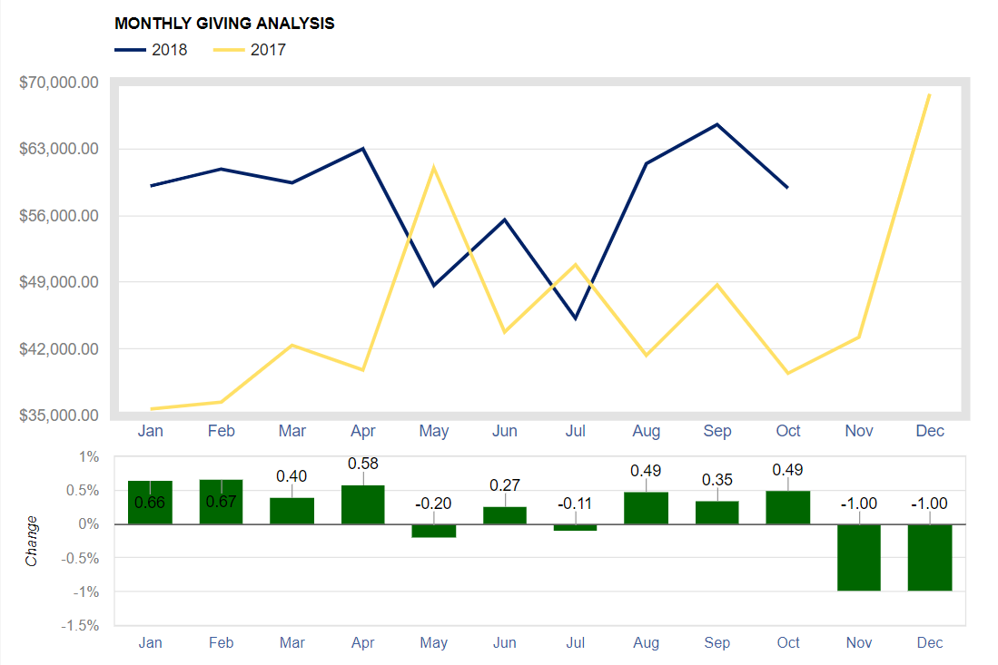
Monthly Giving Analysis
The Monthy Giving chart shows contribution totals for each month of the current and previous years, for purposes of comparison. There will be a data point for each month. If you hover your mouse over the data point, a popup will show the month, year, and amount. The legend above the graph will indicate what line color represents the current year and what color represents the previous year. Of course, the graph line for the current year will end with the current month since there is no data for the future months remaining in the year.
Beneath the main graph is a smaller one showing the monthly percent change from the previous year to the current year.
Monthly Giving Analysis
To customize the graph for an ad hoc look at only one or more specific funds, click the Refine Fund Chart button. In the left panel, click on the desired funds. Each fund you click will be moved to the right panel. (The funds in the right panel are the ones that will be shown on your customized graph.) To remove a fund from the right panel, simply click on it.
When you have all the desired funds in the right panel, click the Draw Fund Chart button and the new graph will be displayed above the button.
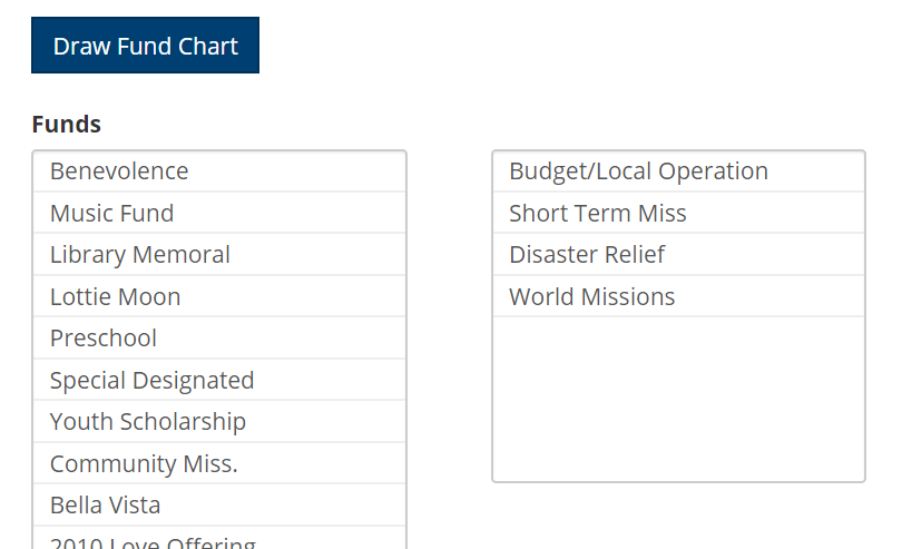
Refine Fund Chart
Monthly Attendance Analysis
The Monthly Attendance chart is very much like its giving counterpart. It shows attendance totals for each month of the current and previous years, allowing you to compare the two. As with the other graph, there is a data point for each month and hovering your mouse over a data point will reveal the month, year, and count. The legend above the graph indicates the line colors used to represent the two years.
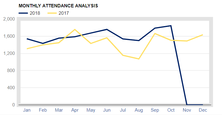
Monthly Attendance Analysis
To customize the graph for an ad hoc look at the attendance for specified organizations, click the Refine Attendance Chart button. Select the desired Program and Division. Then, in the left panel, click on the desired organizations. Each organization you click will be moved to the right panel. (The organizations in the right panel are the ones that will be shown on your customized graph.) To remove an organization from the right panel, simply click on it.
When you have all the desired organizations in the right panel, click the Draw Attendance Chart button and the new graph will be displayed above the button.
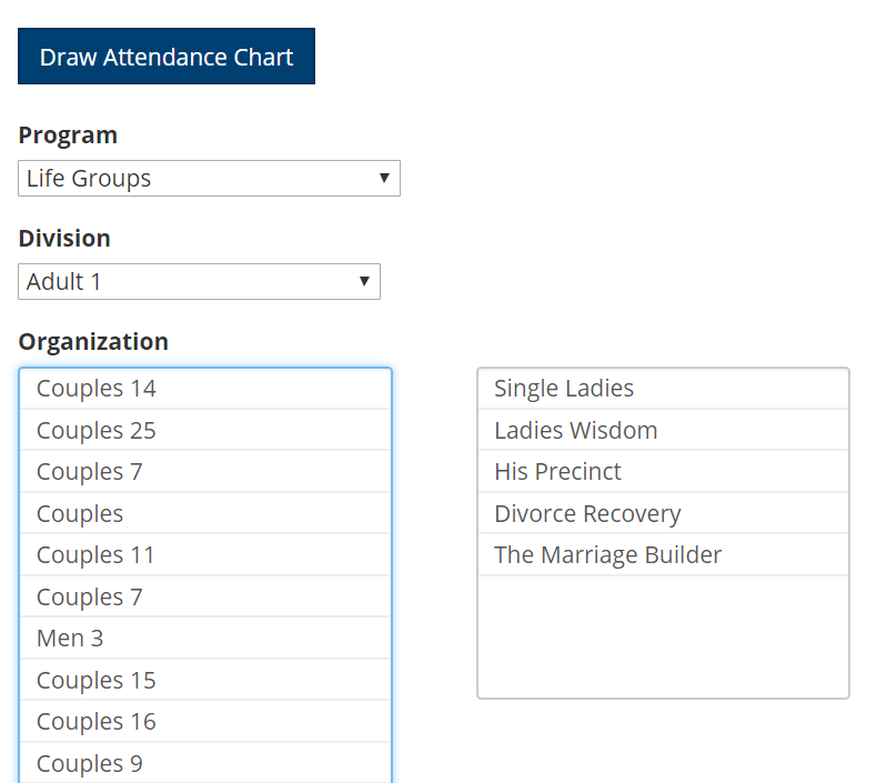
Refine Attendance Chart
Latest Update |
06/16/2022 |
Add Vital Stats Graph Role setting information.