Member Status Chart
This is a simple pie chart that shows a breakdown by the various Member Statuses in your database. You will follow the step by step directions and copy the code below to paste into your database.
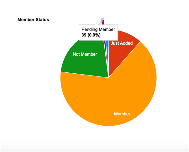
- Sample Chart
When you hover over one of the sections you will see the total number and the percent of the whole.
Create Member Status Chart
- Step 1
Go to Admin > Advanced > Special Content > Python Scripts.
- Step 2
Click the green + New Python Script File, enter name the file
MemberStatusChartand click Submit.- Step 3
Copy all the code below and paste it into the new file.
Click Save Python Script.
- Step 4
Click Run Script. After running it you can Add to Menu.
model.Header = 'Member Status'

data = q.SqlNameCountArray("test", '''
    SELECT Name = ms.Description, Cnt = COUNT(*)
    FROM dbo.People p
    JOIN lookup.MemberStatus ms ON ms.Id = p.MemberStatusId
    GROUP BY ms.Description
''')

model.Script = '''
    <script type='text/javascript' src='https://www.google.com/jsapi'></script>
    <script type='text/javascript'>
      google.load('visualization', '1', {packages:['corechart']});
      google.setOnLoadCallback(drawChart);
      function drawChart() {
        var data = google.visualization.arrayToDataTable(@data);

        var options = {
          title: 'Member Status',
          legend: 'none',
          pieSliceText: 'label',
          slices: {  4: {offset: 0.2},
                    12: {offset: 0.3},
                    14: {offset: 0.4},
                    15: {offset: 0.5}
          },
        };

        var chart = new google.visualization.PieChart(document.getElementById('piechart'));
        chart.draw(data, options);
      }
    </script>
'''.replace("@data", data)
print "<div id='piechart' style='width: 900px; height: 500px;'></div>"
Latest Update |
11/03/2025 |
Updated Save button wording and menu locations