Creating Mobile Responsive Emails
This article outlines how to create emails using TouchPoint’s Mobile Responsive email editor, using an integration with Unlayer.
See also
Creating HTML Emails for information on the HTML email editor.
Creating Templates with Mobile Responsive Email Builder
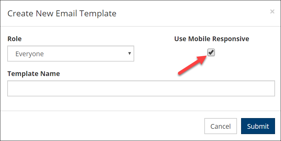
Using the Mobile Responsive builder means your emails will render well in both web and mobile applications. To use this editor for your template creation, go to Admin > Communication > Email Templates, clicking the New Email Template File button, check the box for Use Mobile Responsive. Enter a name for the template and, if desired, select a role. Only users with the selected role will be able to use the template.
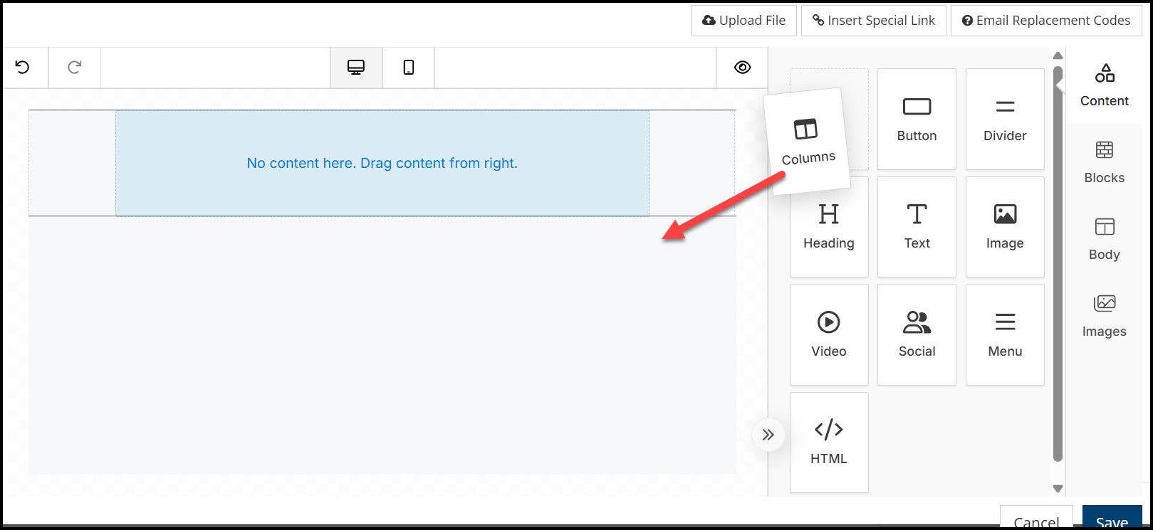
This will bring up the email Compose Email Template page. Click in the yellow outlined box where it says Click here to edit content and the Email Builder will open.
Note
It may take a moment for the builder to fully load. You may get a message to try again. This is not a reportable system issue.
The builder contains the main components of Content, Blocks, Body and Images. When working with each element, additional attributes will be available in the right-hand pane. This can include text and background colors, URL links, fonts, alignment, padding, etc.
Content
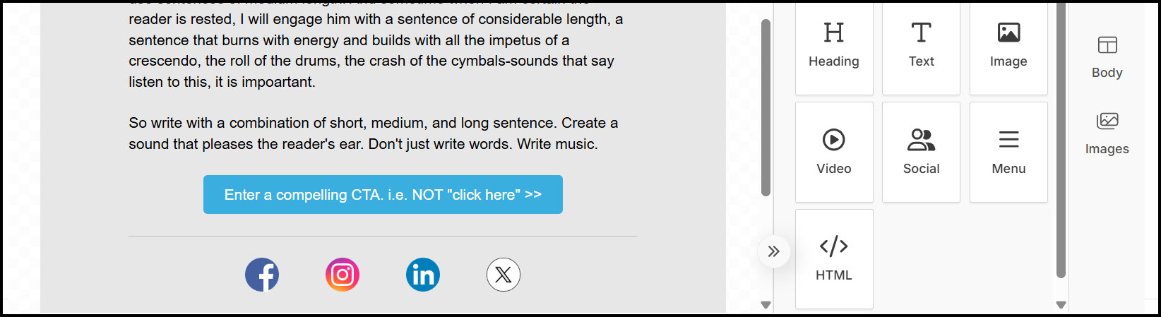
The content menu includes the ability to add columns, buttons, dividers, headings, text, images, videos, social media icons, menus and HTML. Elements will show both in the web and mobile views depending on how the recipient opens their emails. You can choose to have elements Hide in Mobile or Hide on Desktop. The option shows under the Responsive Design section in the editor for each element.
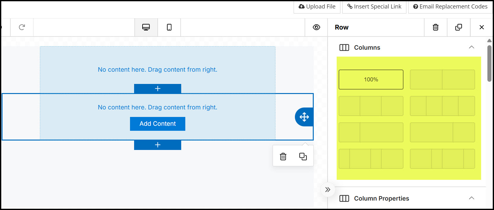
Columns - click on and drag the Column icon over to the left editor panel.
From there you can click on the layout, such as 2 columns, 3 columns, or a proportional option.
Button - The button can be added to a column. You can then edit the background color, the button color, the URL hyperlink among other options.
Divider - Add a divider between sections of your email.
Heading - Easily add Heading (H1,H2,H3,H4) to a column.
Paragraph - Add a text block to your column. Click in the created text box to open a WYSIWIG editor.
Note
Additional fonts cannot be added to the builder nor will the builder recognize fonts that are brought in from pasting content from another source. We recommend creating content directly in the builder for best and predictable results.
Also, email clients have their own font library to use when rendering emails. So when using less common fonts in your emails, the final outcome to the recipient may depend on which email service they use. Email safe fonts include but are not limited to Arial, Helvetica, Times New Roman and Verdana. These and others are already included in the email builder.
Image - Add an image to a column. Click in the created box to open the edit panel, where you can upload a file, choose from Stock Photos, or insert a URL for a photo that you have stored outside of TouchPoint.
Video - Add a video to a column. Click in the created box to add the video URL in the editor pane.
Social - After adding the Social element to a column, choose specific icons from the editor. You will need to add the correct URL for your church for each icon.
Menu - After adding the Menu to a column, click in the box to edit the menu, starting with clicking “Add New Item”.
HTML - Add an HTML block to a column The HTML will be entered in the editor on the right.
Table - Preformatted text table with a removable Header. Rows and columns can be added using a dropdown within each cell.
Blocks
Blocks are another way to add column rows to your email.
Body
Editing the body will allow a global settings such as text color, background color and hyperlink style.
Images
You can access Stock Photos from the Content section, or you can pull image from this shortcut.
General Tools and Settings
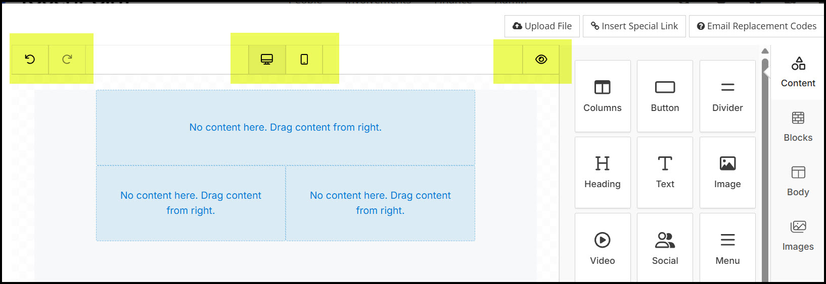
At any time during template creation, you can preview how it will look on either a desktop or on a mobile device, using the buttons at the top center. You also have the option to undo/redo and to view the email on a MAC computer/tablet/device (the “eye” symbol).
Warning
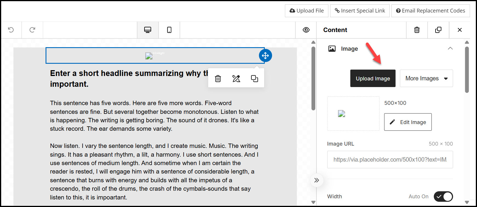
Please be aware that the Cancel button in the bottom right of the editor window is not intended for leaving Preview mode. If you click Cancel you will lose your recent work on the template. Instead, to leave Preview mode and continue your work, click the x in the upper, right corner of the Preview window, as indicated by the red arrow in the screenshot above.
Take note also of the two buttons in the upper right corner of the editor. The Email Replacement Codes button will open, for your reference, a page with our help article on replacement codes. The Insert Special Link button will generate one of the special links available in TouchPoint, such as Register links, Vote links, etc. The URL for the link will be created and copied to the clipboard. You will then need to paste it into the appropriate place (e.g., a button link URL or a link created while editing text).
One utility of templates is that they ensure the proper elements are included in all emails sent by your staff and lay leaders. So don’t forget to include a footer for the template with all the required components. For more on this see Email Footers.
Caution
Unlike templates created using the HTML editor, mobile-responsive templates created will not have sections protected against modifications. Your users will have access to change any and all parts of the template within their emails. With this in mind, give careful thought to who should be able to use the template you create and set the limiting role according. See the next section for more information about this.
Modifying the Supplied Example Template
On your database has been placed a sample Mobile Responsive template named “Example Template”, which you can use as a model to build your own templates with the email builder. You can also customize and rename the Example Template to make it appropriate for your use. Below are some suggestions for the various elements of the template:
- The Top Image
With the template in the editor, click in the placeholder rectangle for the image. In the right panel will be tools for uploading and configuring the image. Click on the Upload Image button to load your own logo or image. An appropriately-sized image will approximate the placeholder size: 500 x 100 pixels.
- Headline, Body, and Button
These three elements, immediately below the top image should likely be modified for each individual email, so you either leave them as they are or provide your own instructions within these elements.
- Social Media Icons
If your church has Facebook, Instagram, Youtube, or Twitter accounts, you can configure the images in this section as links to your social media accounts. For each icon, click on the image. Then, in the right panel, find the Action section and enter the appropriate URL in the Image Link.
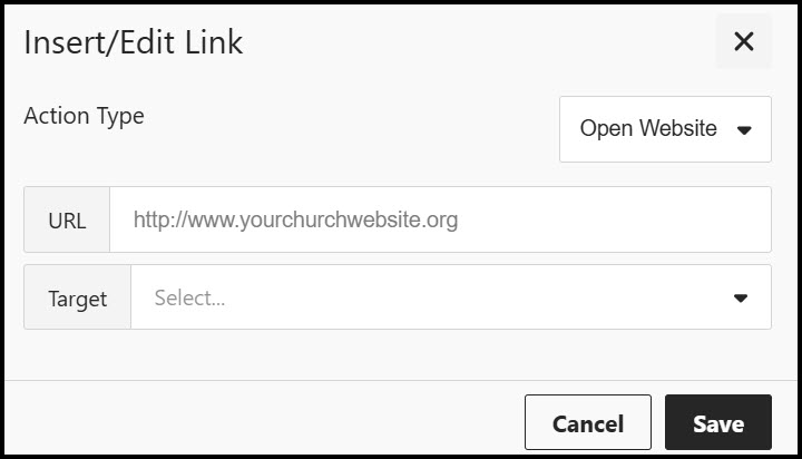
- Church Website
To modify this with your own church website address, click on the hyperlink to bring up the text formatting menu. Then, in the menu, click on the link icon. Modify the URL and whether the link will open in the same tab or new tab. Then click Save.
- Footer
Modify the footer with your own information. But we encourage you to retain all three important components in the sample footer:
Clearly state why the recipient is receiving emails from your church
Provide a way for the recipient to unsubscribe easily
Include the physical address for your church
See also
Latest Update |
2/23/2026 |
Added description of Table option