Retrospective Giving by Range Report
Note
This report is only available if your church uses the TouchPoint Giving payment gateway. Contact Tricia Fourman at Tricia.Fourman@touchpointsoftware.com to learn more about this option.
TouchPoint Giving reports are found under Finance > Reports under Reports in Column One. If your church uses the TouchPoint Giving payment gateway and you are unable to see the reports, send a request to TouchPoint Support to allow visibility.
See also
The Retrospective Giving by Range Report allows you to compare giving behavior between two defined date ranges. The report includes a series of graphs and metrics that highlight not just the change in giving, but the reasons behind those changes, broken down by giving type, gift size, and individual donor behavior.
Filters
Comparison Range From / Comparison Range To (required): Define the time periods you would like to compare by entering the dates using the date picker or choose Today, Yesterday, This Month, This Year or Last Month. Range From defaults to Last Year. Range To defaults to This Year.
Campus: Narrow by campus of the giver. Campus list created through Lookup Codes. Leave blank to see all campuses including those with no campus assigned.
Fund: Select one or more funds to narrow your search or leave blank to view all funds.
View: Change between Donor or Household.
Once you’ve set your parameters, click Search.
Graphs
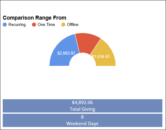
Comparison Range - From: This section shows total giving for the first selected date range. Data is broken down into:
Recurring gifts
One-time gifts
Offline gifts
Beneath the graph:
The total dollar amount given is displayed.
A count of weekend days (Saturdays and Sundays) within the date range is also shown, offering additional context for giving patterns.
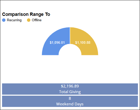
Comparison Range - To: This section shows total giving for the second selected date range. Data is broken down into:
Recurring gifts
One-time gifts
Offline gifts
Beneath the graph:
The total dollar amount given is displayed.
A count of weekend days (Saturdays and Sundays) within the date range is also shown, offering additional context for giving patterns.
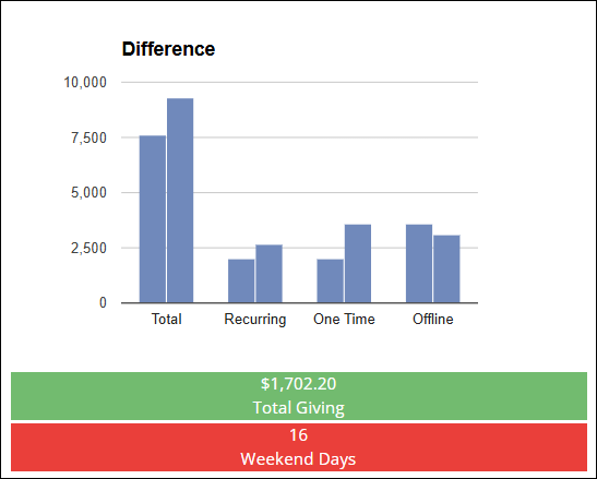
Difference: Use this graph to view the giving totals for the second date range and compare them to the first. It highlights:
Total giving by type (recurring, one-time, offline)
Each type’s contribution shown on the Y-axis
Colors:
Blue bars = First date range
Black bars = Second date range
Legend located below the graph for easy reference
The bottom section displays the total difference in giving:
Calculated as: Second Range - First Range
Positive differences are highlighted in green
Negative differences are shown in red
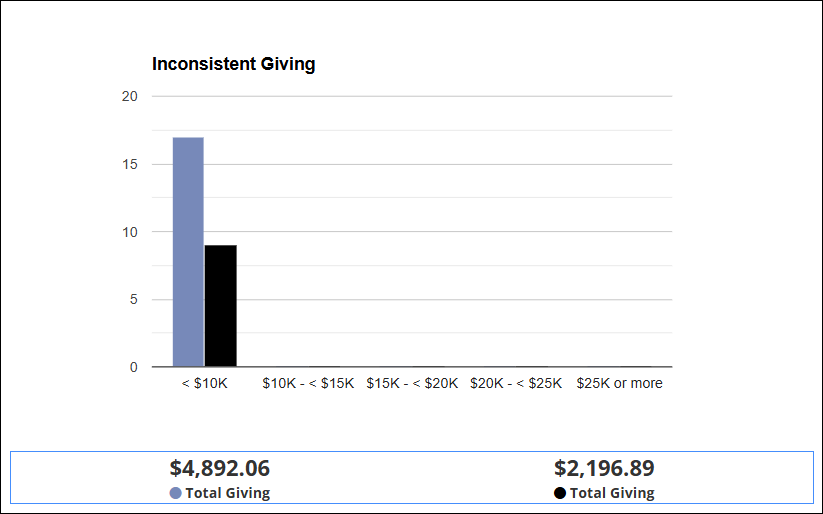
Inconsistent Giving: This graph identifies donors who gave in one date range but not in the other.
Each person appears only once
X-axis: Ranges of total giving amounts
Y-axis: Number of people who fall into each range (whole numbers only)
Note: Y-axis should display whole numbers, not decimals.
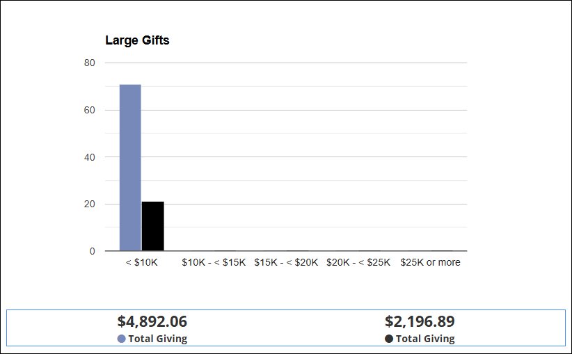
Large Gifts: Displays donors who made large gifts in one range but not the other.
X-axis: Groupings of gift amounts (e.g., $500-$999, $,1000-$4,999)
Y-axis: Number of gifts within each amount group
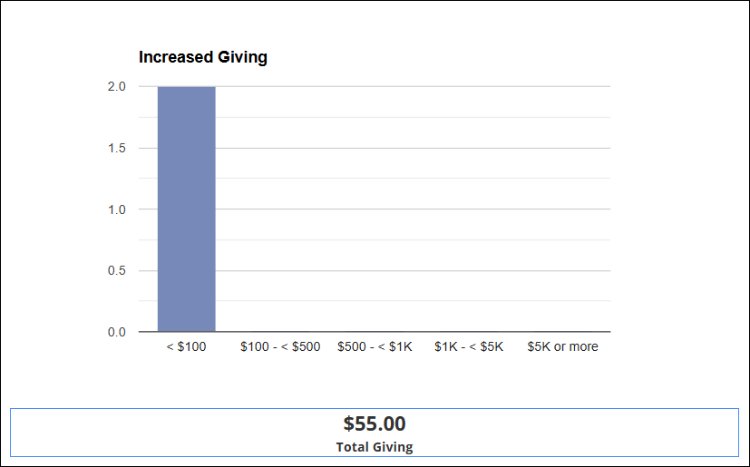
Increased Giving: Shows the number of donors whose giving increased from the first range to the second.
X-axis: Gift amount increase ranges
Y-axis: Number of individuals whose giving increased by that amount
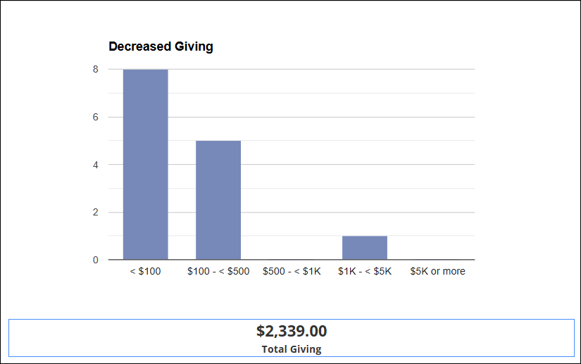
Decreased Giving: Displays donors who gave less in the second range compared to the first.
X-axis: Gift amount decrease ranges
Y-axis: Number of individuals with reduced giving
Latest Update |
7/14/2025 |
Created Article